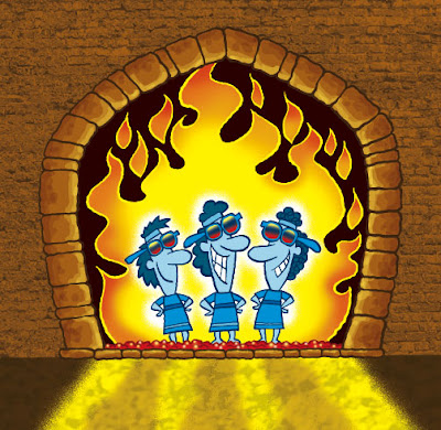
 This is something I have been working on this week and it fits the Illustration Friday theme. Shadrach, Meshach, and Abednego are just VISITORS in the fiery furnace. They won't be staying long. Got places to go... things to do...
 This was more fun 'n games with Photoshop. I threw in some brick texture from a building I took a picture of downtown. The idea here is that the guys are "cool" in the furnace, hence the blue colors and shades. Also gets that blue/orange thing going on, doncha know. A great color combo.
I'm still working on finishing the 100 animals that I posted sketches of. It's turning out to be a loooooong process...
stay tuned....

11 comments:
Blue and orange is, like, my favorite color combo of all time! And I knew this was Shadrach, Meshach and Abednego before I read your words. I used to know some silly song about them... A very fun idea, and rendered beautifully! Hope Sockmo is well!
Thanks Scott... Socmo is taking a little R&R :o)
it's great doug
very funny too
hey, and I also knew the silly song
was it satchmo?
Satchmo is SocMo's cousin...
Excellent work, some nice touches in photoshop.
Great work and nice take on the theme - I especially like the effect of the light from the fire shining in front of the "visitors". It's fun to see you do other characters, but miss SocMo too. You're an incredibly talented fella!
i like the vivid colours and happy expressions!
you know what, Arvindh... when I "save for the web" in Photoshop, the colors are all dulled down. It drives me crazy. If I want to keep the bright colors, I have to do some tricks to preserve them.
That's the one thing I don't like about Photoshop.
Anyone else have this problem?
I also recognized the trio before reading the text. My kids have a Veggie Tale video with the song about 'the bunny'. Great work as always.
Hot Stuff! Ha-ha..
I had the same issue with Photoshop. When I'm working my colour mode is set to either CMYK or RGB, and the Proof Setup (under View) is set to working CMYK. When you go to 'Save for Web,' the preview you are seeing is the RGB view. There are three listed under Proof Setup: Macintosh RGB, Windows RGB, and Monitor RGB.
If you switch your Proof Setup to one of these the colours will look dulled down like you saw on the 'Save for Web' preview. Then just punch your colours up a bit with hue/saturation, or brighten contrast.
Then when you go to 'Save for Web' the colours should retain all their pop. Just make sure that you save your original file as a copy before you switch over to the RGB Proof Setup, because the adjustments you make will make will your image look muddy when you switch back to CMYK Setup.
Sorry, I know that was really long, and there is probably a shorter way to explain this.
I forgot to add that you also need 'Proof Colours' checked on. It's just below 'Proof Setup' in the 'View' drop down menu.
Post a Comment